How to adapt a website for a mobile device
Order
Price from
17711 UAH
Order turnkey website adaptation for a mobile device
We are committed to the principle of minimal interference. We do most of the developments in creating a turnkey adaptation of a website for a mobile device not in the site code, but in parallel with it, without changing the core of the current system, which greatly simplifies the work with the resource for other developers, and also makes it possible to transfer our operating time for a new system with minimal adjustment.
Benefits of creating turnkey website adaptation for a mobile device- SEO
- Optimization
- Accounting
- Automation
- Interfaces
- Marketing
- Programming
Order turnkey website adaptation for a mobile device!
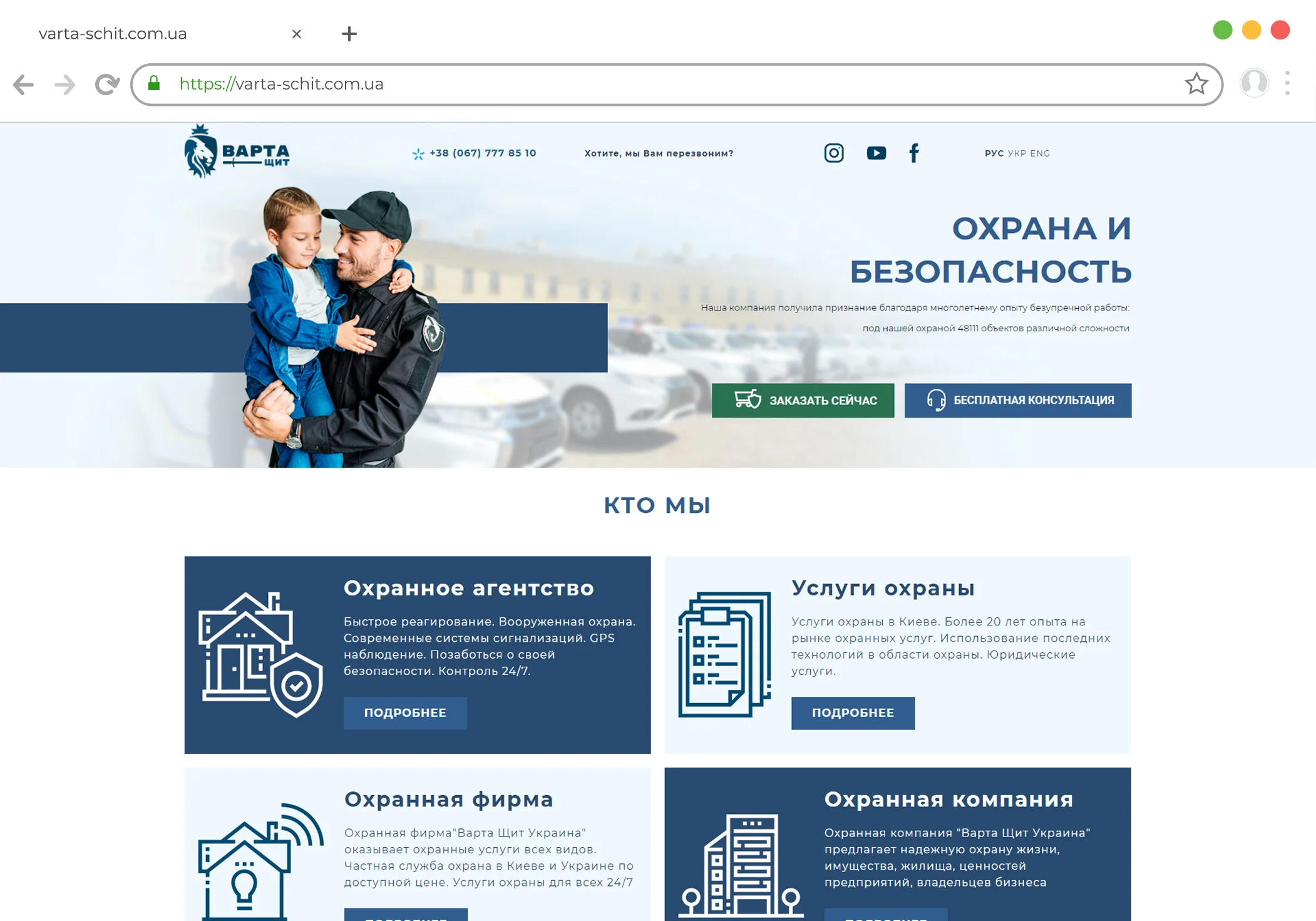
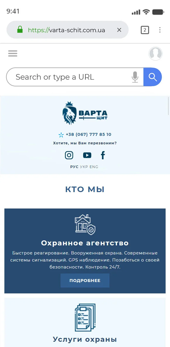
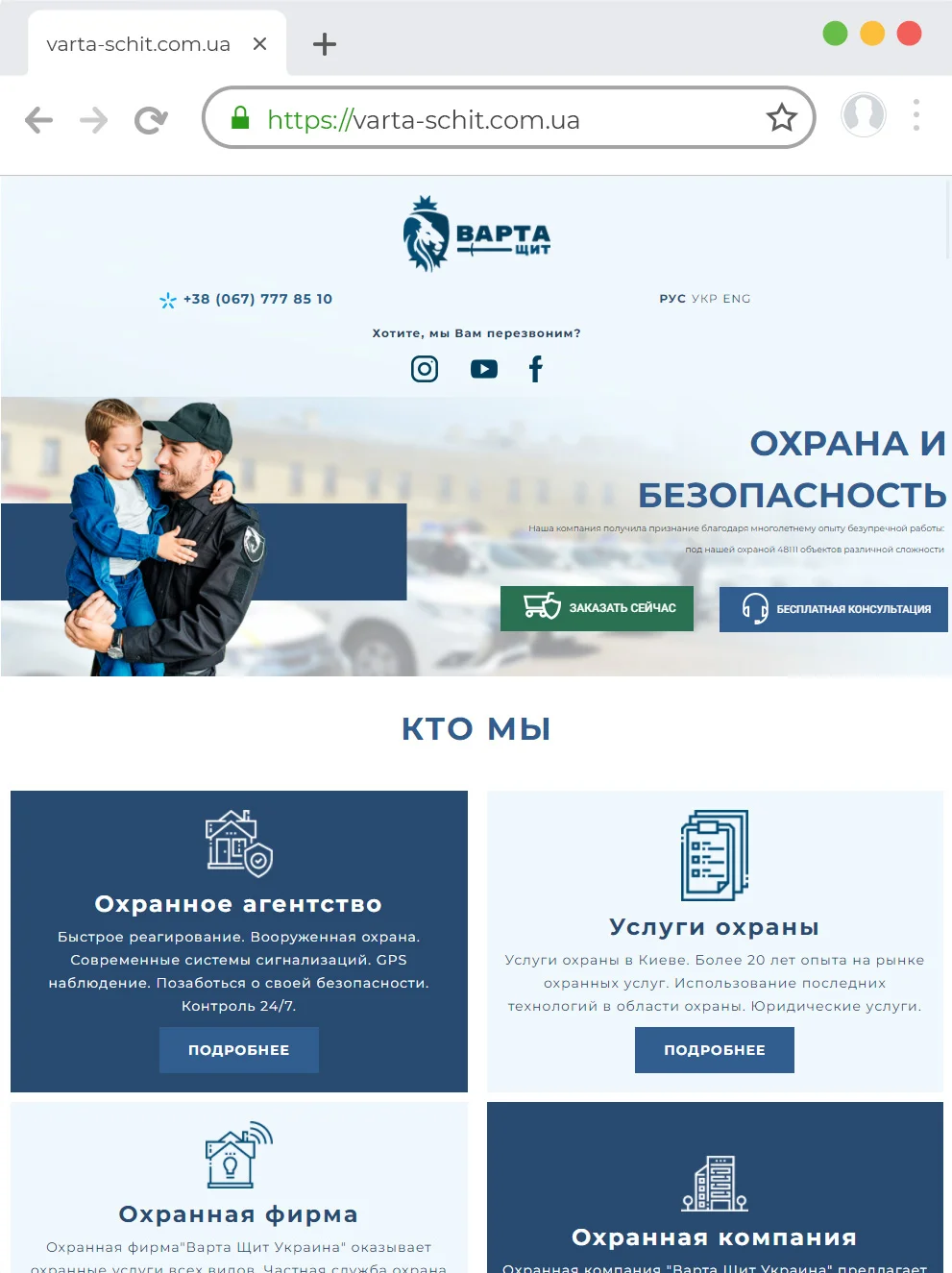
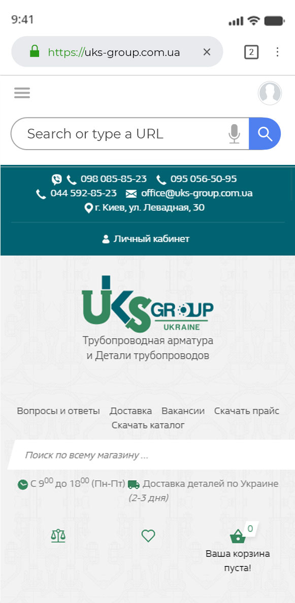
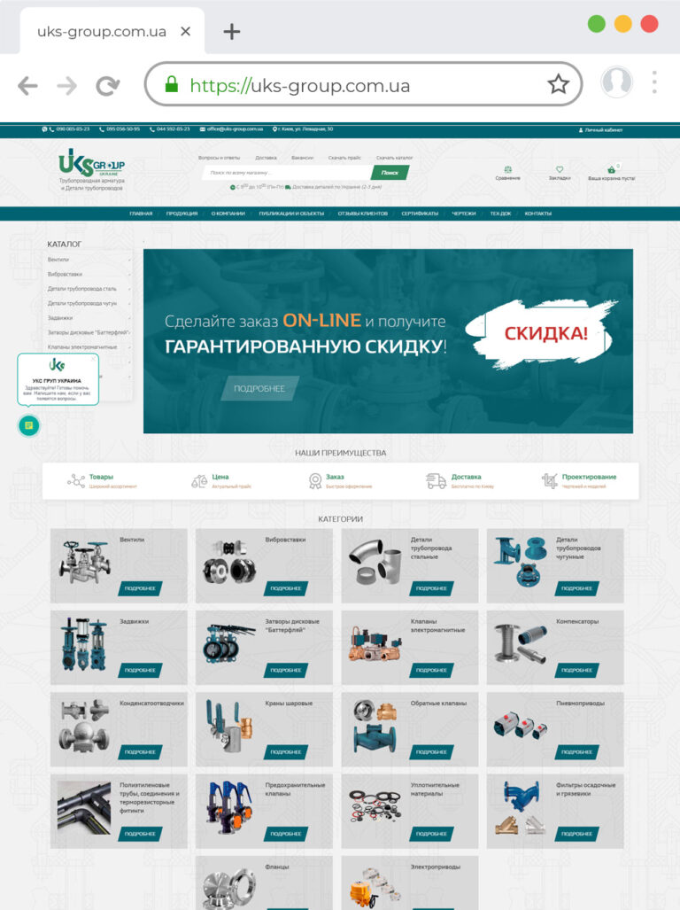
Let's talk about how to achieve a successful scan of a web resource, as well as where you can order a site at an adequate price that will automatically adapt to different mobile devices and browsers. In addition, we will talk about how to establish access of the search system to the necessary settings and avoid the most common mistakes.Adaptation of the site for mobile devices - execution optionsThere are three main ways in which the site is adapted for mobile devices.- Responsive design. The server redirects the same HTML code to all equipment, including smartphones, computers, tablets, but at this time the web page will be displayed slightly differently. It depends on the screen size of the gadget. Google advises to use this method as the easiest if you need to quickly adapt the site for mobile devices.
- Use different URLs. Different devices can use different codes and URLs. The system determines the variant of the mating device, then directs the user to the desired site using an HTTP redirect and the Vary HTTP header.
- Dynamic display. Different gadgets use the same URL with different HTML codes. Selecting a suitable option, the system focuses on the information available in the user's browser.
Required actions
The first thing to do is to inform Google that the web page can be used in conjunction with a particular mobile gadget (or has an analogue that is designed for these purposes). After that, the search engine will be able to redirect users making a search without errors, for example, from a smartphone to the necessary pages.Everyone should remain open for possible scanning. Do not block search engines from accessing the main resource files (including commercials), because it depends on how your pages will be displayed in robots.txt. If Googlebot does not have access to CSS, JavaScript or images, it will not be clear what they will look like in the browser of the mobile device. This means that Google may not recognize that the website is already mobile-friendly. In this case, the images maynot be reflected quite correctly.Adaptation of the site for mobile devices - cost, features
Adaptation of the site for mobile devices (its price is most often included in the cost of creating a web resource in all self-respecting studios) involves pairing with devices running on Android, iOS and Windows. Browsers of such gadgets are able to support a huge number of HTML 5 options. However, their windows are small in size and, as a rule, have a vertical arrangement of the image.If we talk about tablets, the adaptation process is similar to smartphones, with the only difference that the picturesof ki will have large sizes.Browsers on multimedia phones are capable of transmitting images that fully comply with XHTML standards, they support HTML 5 and JavaScript, but sometimes they do not support some API extensions.If you are interested in creating a website, the price of services in a complex or adapting the site for mobile devices, please contact the Web Studio "Bast". This ensures that you receive the following benefits:- usability of navigation elements;
- application of vertically arranged scrolling;
- simple search;
- increased speed of loading pages;
- absence of unnecessary advertising;
- adaptability of pictures, video content, etc.
How to adapt a website for a mobile device
How to create a selling website?
Let's look at a simple example
Orderup to 12 days
As a rule, in the course of a conversation, we discuss a lot and do not always have time to write everything down or draw up an action plan. Therefore, it is better to put everything on paper or draw up a technical task in a document.
- Discussion of the set goal and clarification of tasks
- Collection and analysis of requirements
- Prototype development
- Signing a contract
up to 30 days
Website development process
- Website design development
- Design approval
- Implementation of the developed design on the site
- Connecting the required functionality
- Filling with text
- A / B testing
- Training your specialist to work with CMS
- Delivery of the project
up to 7 days
The final stage of website development is its transfer to hosting. BAST web studio offers you transfer to any hosting that you choose. The only condition on the part of our company for the hosting site is to meet the requirements of the software on which the site was developed.
- Project transfer to customer hosting
- Checking the work of the site on the new hosting
- Site registration in Google and Yandex search engines
- Transfer of access to the site, domain, hosting