Development of a mobile version of the site
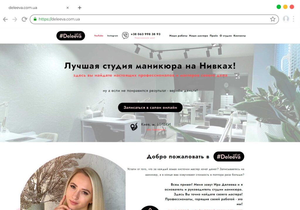
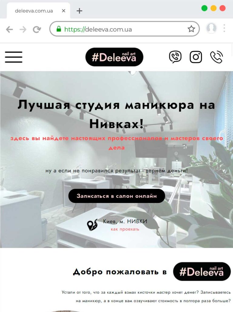
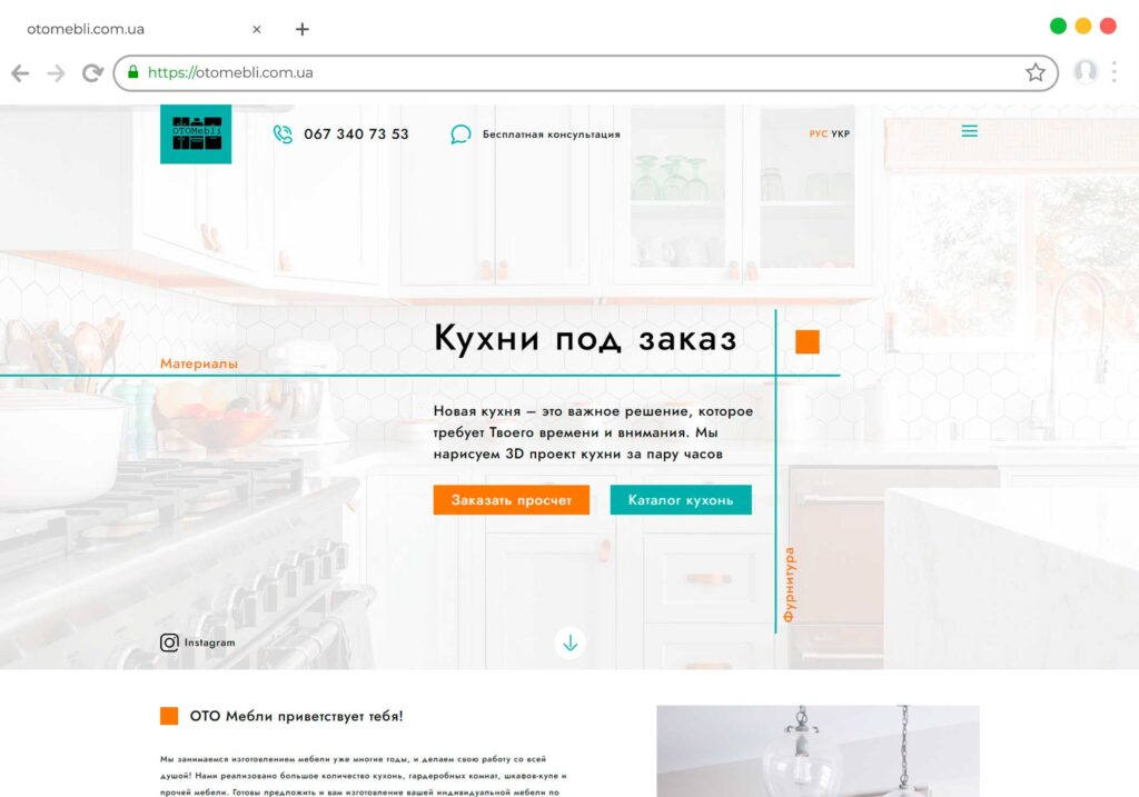
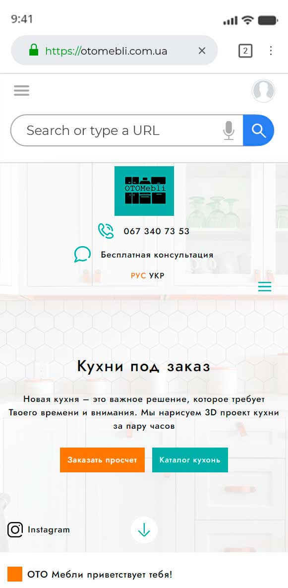
Open your website on mobile and try to place an order or find details about the service. If everything went smoothly, congratulations - your site can be proud to be used on a mobile phone. If you had to squint to read small text, or poke your finger several times, trying to get into the desired button, then some improvements are needed..
Advantages of developing a mobile version of the site- SEO
- Optimization
- Accounting
- Automation
- Interfaces
- Marketing
- Programming

Development of a mobile version of the site
Every year more and more users prefer to use mobile devices to access the Internet. According to statistics, 30% of requests to search engines today come from gadgets running on Android and iOS platforms. Taking this into account, we can confidently say that without adapting the site for mobile devices, you can lose up to a third of the audience. Getting to the desktop version of the site from a smartphone or tablet, the user, in most cases, immediately leaves the resource. This is due to the poor adaptability of the interface for working with mobile devices and, often, incorrect display of site elements, which is very annoying for the visitor..
Why do you need a mobile version of the site
Among the most popular site improvements today it is worth mentioning the development of the mobile version. As for new resources, they are created immediately with a version adapted for gadgets. Is adaptation really necessary? There is information that Google is going to implement a new mobile ranking metric that will measure the responsiveness of a website. Only products that provide maximum comfort to users with devices with any type of screen and resolution will be able to claim the top positions in the search results..
It is quite clear that with such an innovation, one of the most important site promotion it can be considered a quality adaptation for smartphones. According to the latest research, only 35% of Internet resources can be called mobile-friendly, and the share of online stores among them is disastrously small. By ordering the mobile version of a commercial resource, you automatically find yourself head and shoulders above many and get much more customers than your careless competitors.
The main requirements for the development of mobile versions of any resources are as follows:
- High-quality display of content and interface elements on screens with any resolution;
- Minimizing on-screen keyboard usage by using autocomplete and short URLs;
- Support for vertical and horizontal screen orientation;
- Easy access to click elements on touch screens of any type and size.
There are many other subtleties that are taken into account when developing mobile versions, which are accepted taking into account the peculiarities of the web resource, its purpose and design..
How to order a mobile version of the site
Web studio "Bast" offers professional development of a mobile version of the site of any type and purpose. We are ready to create an adaptive product that will look attractive and function flawlessly on any gadgets with iOS, Android or Windows operating systems. What do our web studio clients get??
- High-quality, stably working mobile version of the resource;
- Prompt execution of work within a certain time frame;
- Full client access to the project at any stage of development;
- Warranty from developers;
- Nice price.
It is especially worth noting that the specialists of the web studio "Bast" approach their work creatively and do not recognize template solutions. Choosing our company as a contractor, you can be sure that you will receive an original product, one of a kind, attractive and user-friendly. Flexible pricing policy and an individual approach give us the opportunity to find a compromise in the most difficult cases, and an official agreement on the provision of services guarantees a serious approach to work.
Development of a mobile version of the site
How to create a selling website?
Let's look at a simple example
Order- Discussion of the set goal and clarification of tasks
- Collection and analysis of requirements
- Prototype development
- Signing a contract
- Website design development
- Design approval
- Implementation of the developed design on the site
- Connecting the required functionality
- Filling with text
- A / B testing
- Training your specialist to work with CMS
- Delivery of the project
- Project transfer to customer hosting
- Checking the work of the site on the new hosting
- Site registration in Google and Yandex search engines
- Transfer of access to the site, domain, hosting